


Gajim Ubuntu Iconset
draco


Source (link to git-repo or to original if based on someone elses unmodified work):
-- 0.2
I'm tring to give a more realistic look to these icons. Also, I think that the contrast issue might be minimized by addind some colour to the icons...
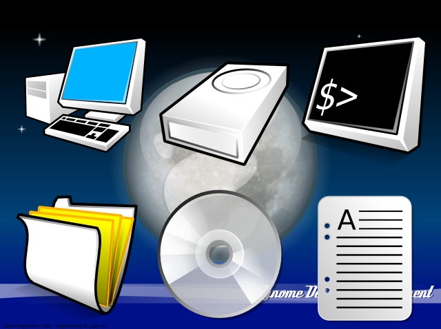
-- Added New Icons
* Network (needs more work)
-- Modified Icons
* Folder
* My Computer
* Hard Disk
* CD-ROM
-- 0.1
-- Added New Icons
* CD-ROM
* Document
* Text-Document
-- Modified Icons
* Folder


Other Icon Sub-Sets:


Ratings & Comments
8 Comments
Great job with these - I like them alot and haven't seen any quite like them. Also, as long as every icon has a nice thick black border, I don't see the light color thing being a problem.
Nice Icons !
keep em comming!
I like the folder icon with the sheets of paper very much. And the document is also looking fine. I'm still worried about the low contrast, though.
Good work Man keep it going
Good job, man! C'mon, mate. Go on with this fine theme
There never can be too much themes. I have some suggestions though; 1) put something into the folder, maybe some sheets of paper. Currently they seem to be some kind of twisted paper. 2) White as the base color is a bad idea, i'd say. Most file manager backgrounds are white or at least very bright. You loose contrast by using white as base color. Maybe you want to try a light grey or beige. 3) IMHO there is an icon theme named Snow Apple. You might want to consider a clearer distinction. I am looking forward to the next version. Thank you.
I agree with the no white as main color point. I skip over ANY theme that is primarily white because I am not one for dark themes. I like light, clean, shiny ... what have you .... but none will look good with white icons. Even pastel loving people will find little reason to use it. As far as nothing being in the folder .. I like it that way. It is different ... why be like the other icon sets?