Description: The Crystal for GNOME team is proud to announce the 1.0 release of the Crystal Clear iconset. Many thanks to the entire team for their help in getting this iconset done as quickly as possible!
This iconset REQUIRES that you have GNOME 2.10+ installed. Starting with GNOME 2.10, GTK stock icons can now be themed through the iconset, rather than through the GTK theme you choose. This has the obvious advantage of not requiring the user to sync their GTK theme up with their iconset, and we will be using this themeing scheme from this day forward. Users of GNOME 2.8 and below are advised to use the Crystal SVG Iconset and the Clearlooks Crystal 1.0.1 GTK2 theme to Crystalize your desktop.
Finally, there is a new Clearlooks Crystal available to go hand-in-hand with this new iconset. This theme is available here:
The changes are really too numerous to detail; suffice to say that the tarball is a good 5MB larger than Beta 2 was, so we've made changes. Trust us. ;-)
Replace the awful blue filesystem icons (22x22)in the Tree view in Nautilus with some nice crystalclear ones. I did it manually and it looks much better
Just so you know, I've moved the file off of Crystalgnome.org; I got a notice the my allocated bandwidth for the month is almost used up, so this file would've become unavailable in the next few days anyway.
A new mirror will be posted soon. Stay tuned.
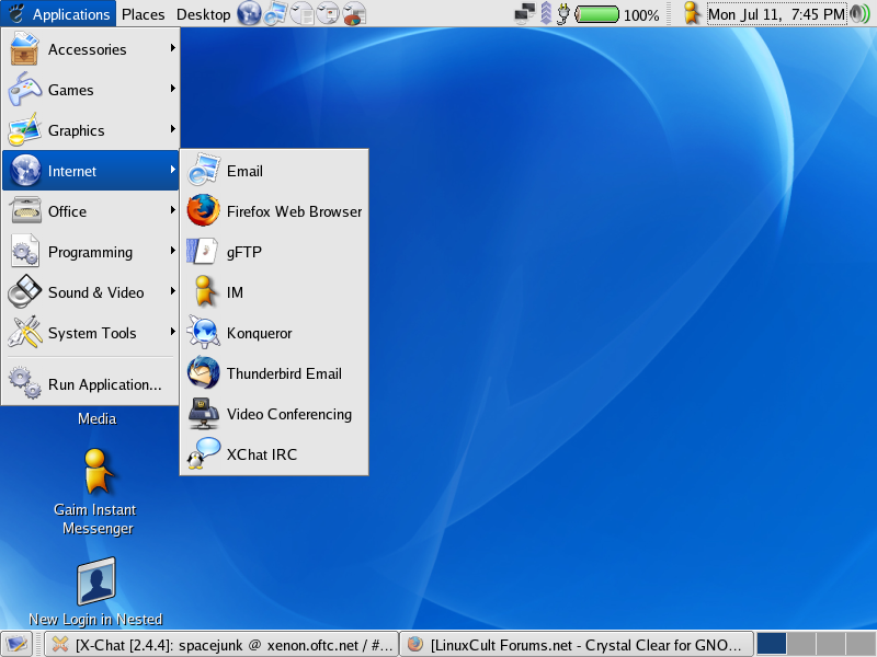
Very nice icons! It's been a while since I used KDE, didn't remember how crystal looked. But there's one thing that bothers me in this iconset...how can those small icons in gnome menu be so blurry? In garGANTuan(my favorite theme so far) vs. Crystal comparison, garGANTuan wins by a mile.
I think that the reason the GANT icons are more clear is because they are made in a completly different style. The fact that alot of the elements are outlined in black also helps them stay crisp looking, even when scaled down to 16x16. Of course, it's also possible that different methods were used when scaling the images down.
garGANTuan is dark with light detail, and usually on a dark background. It also has large dark shadows. These are mostly light and are usually on a very light background and have a very light shadow. Not that there isn't a diff in detail at smaller sizes, just that it would be very difficult to accomplish with this theme w/o actually making the smaller sizes, and even then it's tough. I removed all but the 128 and 22 dir's and edited the index.theme file accordingly.
I noticed blurriness on certain icons (the back and forward arrows, for example, seem to be fine), and I will look into why they look like that.
If it can be remedied, I will do so before the final release.
Thank you for this great theme. I'm dreaming this for a long time.
One question:
The Icon for the 'preferences->Theme' looks a bit weird. It's wooden box.
manowarrior stop telling people stupid things like that. why would you go to gnome-look.org and find kde icon sets that in the instructions say must have GNOME 2.10. your gonna confuse people.
so what was wrong with it? i downloaded it yesterday, and had no problems installing it. i think the problem is... some people need to learn to let go of the mouse =)


Ratings & Comments
25 Comments
I've not tried it out yet, but I've been waiting for this set. In the meantime, where is your project page on Sourceforge.net?
This is a beautiful icon set, but one of the splash icons (the second one) is kde instead of gnome. How can I fix this?
There is nothing in index.theme, which makes the theme useless.
I just downloaded the file off the server and looked at the index.theme file. All was well. Your download might have gotten corrupted.
Replace the awful blue filesystem icons (22x22)in the Tree view in Nautilus with some nice crystalclear ones. I did it manually and it looks much better
Forgot to add Great work so far!!!
I see what you mean about the blue folders; not quite sure why it's set up like that (it does it in KDE too). Will fix for final release.
Just so you know, I've moved the file off of Crystalgnome.org; I got a notice the my allocated bandwidth for the month is almost used up, so this file would've become unavailable in the next few days anyway. A new mirror will be posted soon. Stay tuned.
New URL posted. http://donk.ti-news.net/junk/CfG-CrystalClear-1.0.0b2.tar.bz2
Very nice icons! It's been a while since I used KDE, didn't remember how crystal looked. But there's one thing that bothers me in this iconset...how can those small icons in gnome menu be so blurry? In garGANTuan(my favorite theme so far) vs. Crystal comparison, garGANTuan wins by a mile.
I think that the reason the GANT icons are more clear is because they are made in a completly different style. The fact that alot of the elements are outlined in black also helps them stay crisp looking, even when scaled down to 16x16. Of course, it's also possible that different methods were used when scaling the images down.
garGANTuan is dark with light detail, and usually on a dark background. It also has large dark shadows. These are mostly light and are usually on a very light background and have a very light shadow. Not that there isn't a diff in detail at smaller sizes, just that it would be very difficult to accomplish with this theme w/o actually making the smaller sizes, and even then it's tough. I removed all but the 128 and 22 dir's and edited the index.theme file accordingly.
I noticed blurriness on certain icons (the back and forward arrows, for example, seem to be fine), and I will look into why they look like that. If it can be remedied, I will do so before the final release.
Thank you for this great theme. I'm dreaming this for a long time. One question: The Icon for the 'preferences->Theme' looks a bit weird. It's wooden box.
thanks for work
Can't you just install KDE?It's not for GNOME,i think
manowarrior stop telling people stupid things like that. why would you go to gnome-look.org and find kde icon sets that in the instructions say must have GNOME 2.10. your gonna confuse people.
Yes, the original release was for KDE. We ported it.
Ok i have downloaded this great looking icon set but it doesnt work i have Gnome 2.10 but it says invaild format help me out!! Thankx
Try opening it in file-roller and then saving it with the ending tar.gz ... that should do the trick
It appears that the uploaded file is broken; I will upload a replacement ASAP. Sorry for the problems. :(
File should be alright now.
so what was wrong with it? i downloaded it yesterday, and had no problems installing it. i think the problem is... some people need to learn to let go of the mouse =)
I downloaded it and got a corrupted archive (maybe something happened to it on the server) so I just re-uploaded.
that's odd. i did grab it quote soon after it was posted (before any comments were posted at least). so i guess it must have been the server.