


Dropbox ubuntu-mono Icons
piotrekp


Source (link to git-repo or to original if based on someone elses unmodified work):
0.1 initial release dark-grey and grey version
0.2 redesigned, SVGs included
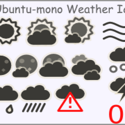
0.3
-minor changes to all icons
-redesigned: weather-showers-scattered, weather-snow and weather-storm
-added weather-severe-alert
0.4
-almost all icons were changed, now they shouldn't be so blurry
0.45
-new weather-fog; now it looks like fog
-added gradient to weather-showers
0.5
-filled weather-overcast and weather-severe-alert
0.6
-redesigned weather-clear, weather-few-clouds, weather-storm, weather-snow
Let me know if You like it.
-minor changes to weather-clear-night and weather-few-clouds-night
0.65
-changed weather-showers-scattered
-minor changes to weather snow
0.7
-new weather-showers more consistent with other icons
-weather-overcast doesn't need dark clouds ;-)
-weather-severe-alert now with red attention sign
-minor changes to weather-storm
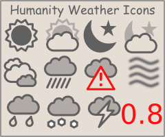
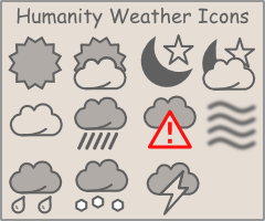
0.8
-completely redesigned all icons, now cloud icons look better
package divided to light-panel (dark icons) and dark-panel (light icons). theme.
0.81
-minor changes to weather-few-clouds and weather-few-clouds-night (changed colors)


More Icon Sub-Sets from piotrekp:
Other Icon Sub-Sets:


Ratings & Comments
29 Comments
I love the bumpy clouds of the 0.7 version and prefer the thinner outline and slightly lighter color of it. Can you please re-upload the 0.7 version? It's exactly what I'm looking for.
Hi janet, unfortunately my dropbox content was cleaned and I don't have any backup of 0.7 version. Sorry.
That's life... But anyway thanks for answering.
These are great! These ought to be default in Lucid, is there any word on this happening?
Lucid theme will have its own version. Here is screenshot (2x zoom): http://dl.dropbox.com/u/375688/bitmap.png
Hmm, well imho those aren't as good as your version but they are pretty good too and will integrate much better! Thanks for the link, great work!
The icons 'clouds' and 'few_clouds_night' have a significantly lighter coloured sun/moon than the foreground. They are barely readable unless I use a very light respectively dark toned panel. Great icons though!
Thanks for comment:) You are right, it might be not readable in some circumstances. I will make it a little darker. Would You sending me a screenshot of your notification area? This will make it much easier to match the color.
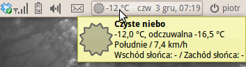
Hi.. i wonder, what kind of font setup are you using on third printscreen.. Thanks.
I use Droid Sans size 9, color #606060, color of background of Selected Items is #969696. Of course default Human gtk theme.
Added your icons to my project, nice work mate! Thanks for the upload ;) Alex
Thanks for your time & energy in creating these icons.
Just wanted to let you know, that it is possible to put icons in user home directory ~/.local/share/icons/gnome/ It will not be system wide use, but it will certainly not mess up system icons.
Thanks for the tip :)
It's also possible to just throw them in the status folders of the Humanity and Humanity-Dark theme folders. That way you don't overwrite anything, and it remains system wide (assuming those themes are installed as root, which they are in Karmic).
Hey mate why don't you make a script for installation?
Wait till natewiebe13 update Humanity Panel Icons Theme. He will replace old weather icons with new ones :)
Absolutely fantastic!
very nice thanks!
great job, thanks..
I downloaded a version prior to Nov. 11 and the dark ones (for dark panel) didn't match with the monochrome icons of Humanity-Dark. Yours are too light. I can't tell, but I'm sure it's the dark ones being displayed and not the light ones. (I rebuilt the icon cache as well and logged out and back in.)
Icons for dark themes like Dust (so brighter icons) use #969696 color (I took it from speaker icon in tray). For the light themes (like karmic default) color is #606060. Maybe I made a mistake earlier, but now I'm sure that the colors are right like I wrote. Would You mind giving me a link to screenshot of your tray?
Check out the linked-to screenshot and tell me what you think. Notice how your icons are lighter than the rest? http://picasaweb.google.co.uk/mikejde/Misc#5402889634281836274
On screenshot the weather icon is darker then other ones because You took darker icons. Copy lighter icons and everything should be fine. All color themes are included in package.
I'm an idiot. I was thinking the light/dark folders you created were for Humanity and Humanity-Dark, but actually it's the other way around. You might want to make a note of this for others who, like myself, are a bit slow to catch on.