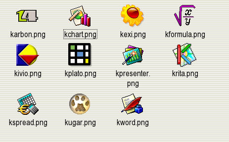
I love the HiColor icons (umm.. retro) but the Kivio and Kexi icons don't match the others. I don't think it's your fault but they need to be more "pixelized" (that word exists?)
The Kivio icon is the original one and yes, it doesn't really look like the others.
I think that the Kexi icon can be improved. It is derived from the Crystal one. But, having something is better than the having the unknown icon pop up. :-)
As I commented previously about the HiColor/KDEClassic MIME type icons for KOffice, I am puzzled about those that apparently gave a negative rating but left no comments.
See, that is what I mean. I don't understand the comment.
Did I do a poor job collecting them?
Did I do a poor job making the 22x22 icons using cubic oversampling with The GIMP.
Do you not like the Kexi icon?
I do Crystal icons too. But, these are HiColor icons ...
It makes no sense to give this a poor rating because you don't use HiColor icons. Understand??


Ratings & Comments
5 Comments
I love the HiColor icons (umm.. retro) but the Kivio and Kexi icons don't match the others. I don't think it's your fault but they need to be more "pixelized" (that word exists?)
The Kivio icon is the original one and yes, it doesn't really look like the others. I think that the Kexi icon can be improved. It is derived from the Crystal one. But, having something is better than the having the unknown icon pop up. :-)
As I commented previously about the HiColor/KDEClassic MIME type icons for KOffice, I am puzzled about those that apparently gave a negative rating but left no comments.
Hum... they give a nice Windows 3.1 look...
See, that is what I mean. I don't understand the comment. Did I do a poor job collecting them? Did I do a poor job making the 22x22 icons using cubic oversampling with The GIMP. Do you not like the Kexi icon? I do Crystal icons too. But, these are HiColor icons ... It makes no sense to give this a poor rating because you don't use HiColor icons. Understand??