


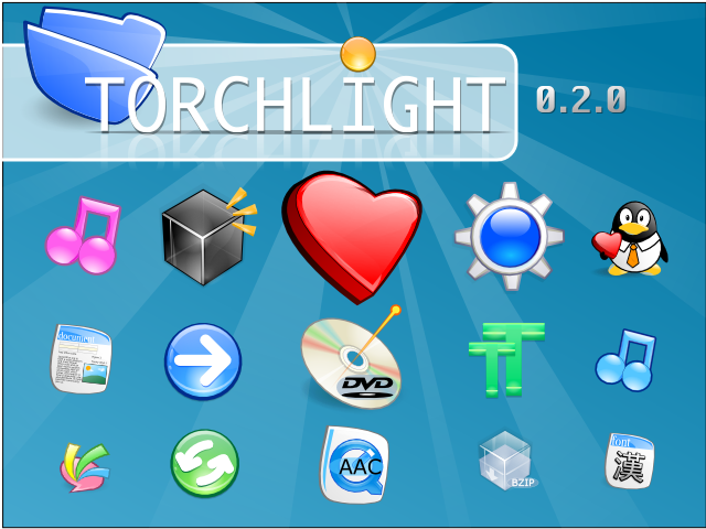
I am glad to announce the 0.2.0 final of Torchlight!
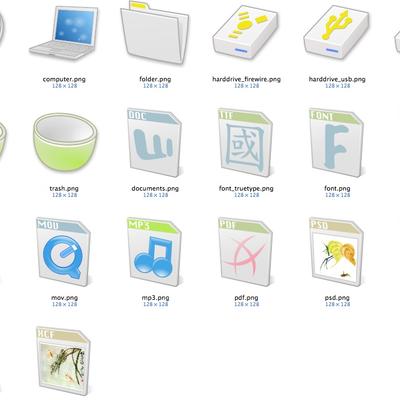
0.2.0 is the result of several weeks' work. Although there are still a lot of icons to be implemented, 0.2.0 offers you a lot of eyecandies.
======UPDATE:======
I am sorry Torchlight will no longer be updated as an icon set due to various reasons.(Sept. 03, 2005). I will start another project called Ricebowl soon.
-------------------
Hope you enjoy these icons!
AND THANKS TO:
- Inkscape: all these icons are designed with it.
- GIMP: some of these icons may be edited with it.
- Mandriva Linux: the platform.
- All the other GNOME and KDE artists who have inspired me.
- DeviantArt: hosting
AN

All the graphics in these icons are created from scratch.
QuickTime(TM) and RealPlayer(TM) logo are trademark or registered trademark of Apple Computer Inc. and RealNetworks, respectively.


Ratings & Comments
14 Comments
I was disapointed you were going to stop developing torchlight until i saw these. i think they are much nicer as well. cant wait for them to get developed further. a style like this is really missing in KDE.
oops, replied to the wrong post. that ^ was meant for ricebowl.
...Ouch
great iconset! but is it possible to publish the svg's from it?
Your icons are very cool, please keep up the good work.
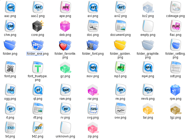
nice work, just make the mimetypes a bit more shiny... but thanks for your iconset, it's great !!!
These are looking nicer and nicer! My only suggestion is a reiteration of what I said before. The cartoonish appearance of the mimetypes don't seem to jive with the clean cut crystal appearance of the other icons. I would say take another look at the mimetypes, consider redesigning them. The new boxes look very crystalish, indeed. Very impressive work. Keep it up!
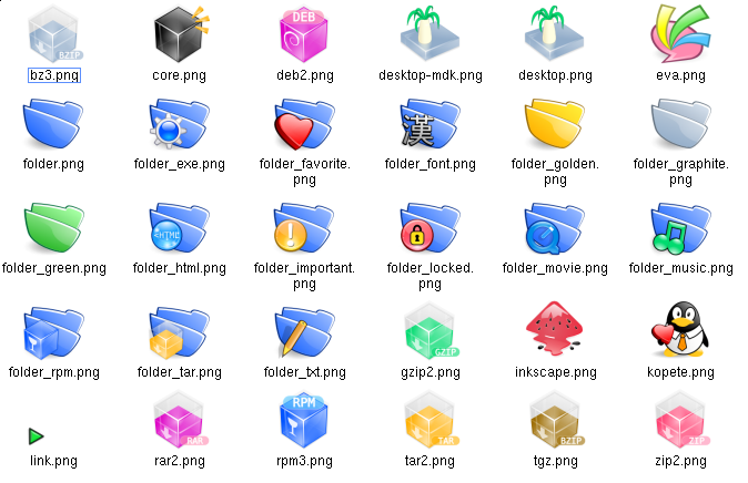
I love the crystal buttons. These kind of things can always attract me easily. The file type icons are nice, too. Those blue file folder icons are fine but the yellow and gray ones need expanded contrast. Concerning the CD & DVD icons, I agree with Hintzy's opinion. And I think the most serious problem is about those present boxs. They don't look crystal at all. Maybe you can give them a brand-new face?
Thanks. I may make those box more crystal. And because I mix all kind of icons together, the consistency problem would seem more serious than it is. Usually you can only see actions together on toolbar, foler and mimetypes together, devices together. The CD icons are not soft? This is a bit weird to me because I feel them soft...Don't know how to make them softer, LOL...
By softness i think we may be talking about the shape. Everything else seems to have a distorted and 'softened' shape. The cd and dvd icons look like they may cut through something if you threw them hard enough. =] But i love the iconset. It looks beautiful, i especially dig the compression icons and inkscape.
same to me ^_^ My favorite are Inkscape, compression including deb and rpm, desktop, eva and cd/dvd burner. Well I totally understand that unity of style is something many people want. However it is not the goal of Torchlight. In contract, Torchlight kind of want differences between different types of icons.
I agree somewhat with memphidoo's comment about the consistency. Mostly it's the CD and DVD icons that stand out from the rest, in my opinion. The icons for MIME types, folders, and buttons all have sort of a soft, rounded, almost cartoonish look to them, which I love. I think the CD and DVD icons would look better if they were softened somehow to fit into that style. Overall, I think what you have here looks great and I can't wait to see more!
There are a lot of nice icons in here. However, a lot of them look to be knockoffs of everaldo's crystal icons (the blue ones), and the rest don't seem to have a consistent look or feel. However, it's obvious that you have great ability, and I'm looking forward to your future releases.
Yes, Crystal is a very great icon set. I am inspired by it and kind of follow the fashion. Consistency is always a problem for me but I will make sure there are something underlying to be consistent. At least for the same series. Such as packages, archives. Thanks for comment!