I saw ALL the themes here and on Gnome-Art, and only two themes pleased me, this and the Monochromatic-Black theme. the last one, don't accept transparency on tool bar, and this have the check in the check box too clear on Firefox, that i can't differentiate between the box checked and not checked, i don't know why. I hope this become more visible, on new releases. :)
But that's all, the rest of the theme is GREAT!
Keep the great work.
Thanks.
I actually had to stop using this theme because of the very light text on light/white backgrounds *but* the second this is fixed I know for sure it will be my default for a very long time... To be honest, I sometimes apply it when I know I am not going to work with applications that suffer from this side effect. Anyhow, it's 9/10 until that problem gets fixed!
I am too lazy to play tinker with it *but* if someone knows where to look exactly to try and fix this, please let me know!
Please, keep tweaking this theme! It is by far the best ever and I never ever liked darked themes... Just this theme is perfect. The only gripe about it, is extremely bright text pops up on very light backgrounds (rare) with some applications making the text unreadable... Other than that it is beautiful! Please keep it up!
Yeah, text on aMule is most light grey on white, and the popups notification too (used in IM in my case). It remains a beautiful GTK2 theme which is very eyes-friendly :).
Just only a few minutes after my first post I decided to play around with the bright fonts on light backgrounds and imho I think I've come up with a fair compromise. I simply changed that gray font color to a darker gray *but* not so dark as to do damage to everything else or to take away from the original scheme. It's dark enough to be readable on bright backgrounds yet, light enough on darker backgrounds...
I changed the value on line 19 in the gtkrc file from "#eaeae2" to "#acaca7". This seems to be a fair compromise on a 24bit display. Try it out and let me know what you think!
It's much better on notification popups. Strangely some tooltips (not all) use this color for text it display now (Gajim Jabber Client 0.9.1 do that). Maybe it's a Gajim mistake.
Finally it's seems to affect all tooltips and some text in tabs. So it is not very friendly-readable with this modification, maybe better way should be to find how to set color on notifications popups, or not.
Would you know why the theme gets a glossy overshine on most of the controls and borders in Ubuntu Dapper Flight 1? The shine makes the theme look bubbly instead of Strong. Curious. Thanks!
I really love your StrongLooks theme!. You've really helped out and made Gnome look sexy with this one. Thank you so much for your time and energy it is greatly appreciated!
PS. I apologize for the confusion regarding Synaptic and Gedit. It turns out those apps get themed perfectly...
Are you the author of the Blended theme? I love that border so much... It really has to be the best. I didn't even know you created the stronglooks theme *but* I was very attracted to it. Upon checking it out, I did not like how it handled some windows like Synaptic on Ubuntu... It creates some ugly bevels *but* if those bevels were taken care of and made flat or barely noticable and made very light, this would be a very sexy theme... I want it badly :P Please consider creating a few lighter variations (if possible). + I really love the width of the scrollbars in this theme, they're perfect! This really is a nice theme, please consider fixing those ugly borders found within some apps like Synaptic... Thank you!


Ratings & Comments
13 Comments
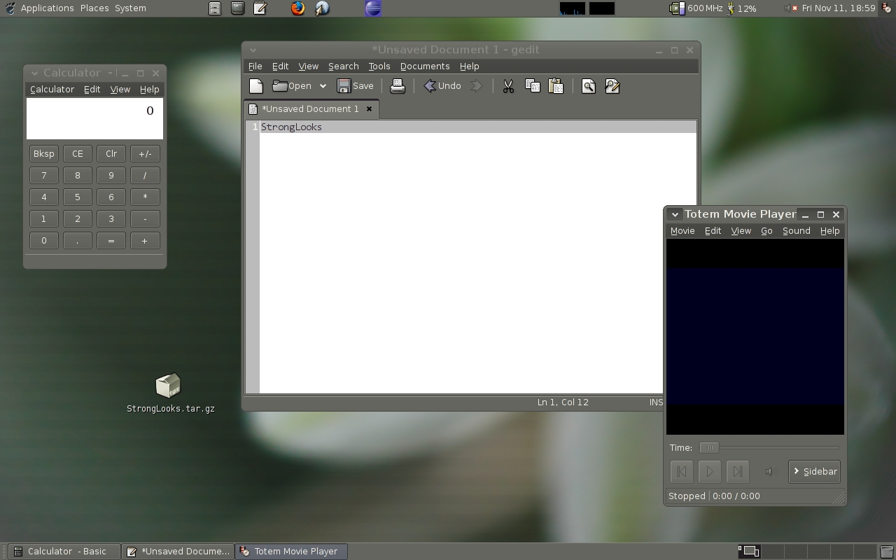
I saw ALL the themes here and on Gnome-Art, and only two themes pleased me, this and the Monochromatic-Black theme. the last one, don't accept transparency on tool bar, and this have the check in the check box too clear on Firefox, that i can't differentiate between the box checked and not checked, i don't know why. I hope this become more visible, on new releases. :) But that's all, the rest of the theme is GREAT! Keep the great work. Thanks.
I actually had to stop using this theme because of the very light text on light/white backgrounds *but* the second this is fixed I know for sure it will be my default for a very long time... To be honest, I sometimes apply it when I know I am not going to work with applications that suffer from this side effect. Anyhow, it's 9/10 until that problem gets fixed! I am too lazy to play tinker with it *but* if someone knows where to look exactly to try and fix this, please let me know!
Please, keep tweaking this theme! It is by far the best ever and I never ever liked darked themes... Just this theme is perfect. The only gripe about it, is extremely bright text pops up on very light backgrounds (rare) with some applications making the text unreadable... Other than that it is beautiful! Please keep it up!
Yeah, text on aMule is most light grey on white, and the popups notification too (used in IM in my case). It remains a beautiful GTK2 theme which is very eyes-friendly :).
Just only a few minutes after my first post I decided to play around with the bright fonts on light backgrounds and imho I think I've come up with a fair compromise. I simply changed that gray font color to a darker gray *but* not so dark as to do damage to everything else or to take away from the original scheme. It's dark enough to be readable on bright backgrounds yet, light enough on darker backgrounds... I changed the value on line 19 in the gtkrc file from "#eaeae2" to "#acaca7". This seems to be a fair compromise on a 24bit display. Try it out and let me know what you think!
It's much better on notification popups. Strangely some tooltips (not all) use this color for text it display now (Gajim Jabber Client 0.9.1 do that). Maybe it's a Gajim mistake.
Finally it's seems to affect all tooltips and some text in tabs. So it is not very friendly-readable with this modification, maybe better way should be to find how to set color on notifications popups, or not.
Would you know why the theme gets a glossy overshine on most of the controls and borders in Ubuntu Dapper Flight 1? The shine makes the theme look bubbly instead of Strong. Curious. Thanks!
I really love your StrongLooks theme!. You've really helped out and made Gnome look sexy with this one. Thank you so much for your time and energy it is greatly appreciated! PS. I apologize for the confusion regarding Synaptic and Gedit. It turns out those apps get themed perfectly...
very nice theme.
Great, glad you like it! :-)
Are you the author of the Blended theme? I love that border so much... It really has to be the best. I didn't even know you created the stronglooks theme *but* I was very attracted to it. Upon checking it out, I did not like how it handled some windows like Synaptic on Ubuntu... It creates some ugly bevels *but* if those bevels were taken care of and made flat or barely noticable and made very light, this would be a very sexy theme... I want it badly :P Please consider creating a few lighter variations (if possible). + I really love the width of the scrollbars in this theme, they're perfect! This really is a nice theme, please consider fixing those ugly borders found within some apps like Synaptic... Thank you!
Thank you, just replied to your email. :-)